Loading...
Beginner10 min
Build a social media card.
News broadcasts frequently show social media posts on screen — a tweet from a public figure, an official statement, or a viral post. This card displays the user's name, handle, and post text with an auto-generated avatar. It's positioned on the right side of the screen, leaving the anchor visible on the left.
Social Card — OGraf Template
1920 x 1080
What's different from other graphics?
Right-side position
Uses right: 48px; bottom: 80px instead of left. This keeps the anchor visible on the left side of the frame — a common broadcast convention for displayed content.
Auto-generated avatar
No image needed. The avatar circle shows the user's initials, extracted from their name with _getInitials(). Nothing to host, nothing to break.
Two-stage entrance
The card slides in from off-screen right with a light blur over 0.7s, and the avatar pops in 0.35s later on an overshooting curve — all from CSS, keyed off one .visible class.
The initials method
Instead of requiring a profile photo URL (which may break, be low-res, or have rights issues), the social card generates an avatar from the user's name. _getInitials splits the name on spaces, takes the first letter of each word, upper-cases them and keeps the first two: "Jane Smith" → "JS", "Dr. Martin King" → "DM", "Madonna" → "M", and an empty name → an empty avatar. _applyData is shared by load() and updateAction(); it applies each field that is !== undefined, so a partial update touches only the fields you send and an empty string clears one. It also accepts an optional platform string for the dark badge in the header. The manifest schema doesn't declare it, so by default the badge is empty — and .social-platform:empty hides it rather than leaving a blank capsule.
graphic.mjs (key parts)JavaScript
_getInitials(name) {
  if (!name) return '';
  return String(name).split(' ').filter(Boolean).map(w => w[0]).join('').toUpperCase().slice(0, 2);
}

_applyData(data) {
  if (!data) return;
  if (data.user !== undefined) {
    this._userName.textContent = data.user;
    this._initials.textContent = this._getInitials(data.user);
  }
  if (data.handle !== undefined) this._handle.textContent = data.handle;
  if (data.text !== undefined) this._text.textContent = data.text;
  if (data.platform !== undefined) this._platform.textContent = data.platform;
}

async load({ data } = {}) {
  this._initDom();
  this._applyData(data);
  return { statusCode: 200 };
}
Playing and stopping follow the OGraf step model. The first play puts the card on air at step 0 and resolves after 700ms; a second play goes past the single step, runs the stop and returns currentStep: undefined. Every action bumps this._rev, and the stop only removes .visible after its 500ms if nothing newer has started — so play → stop → play sent without waiting ends on air.
graphic.mjs (play and stop)JavaScript
/**
 * The step a playAction() lands on, exactly as the spec defines it: `goto`
 * wins; otherwise the current step (-1 before the first play) plus `delta`,
 * which defaults to 1. A target at or past stepCount means "go to the end",
 * returned as undefined — so a second play on a one-step graphic takes it off
 * air instead of replaying it.
 */
function resolveTargetStep(currentStep, { goto, delta } = {}, stepCount = 1) {
  const target = Number.isInteger(goto) && goto >= 0
    ? goto
    : (currentStep ?? -1) + (Number.isInteger(delta) ? delta : 1);
  return target >= stepCount ? undefined : Math.max(target, 0);
}

// Each action takes the next revision number. Anything that finishes after a
// newer action has started checks it and backs off, so play → stop → play
// sent without waiting ends on air instead of hidden by the stale stop.
async playAction({ goto, delta, skipAnimation } = {}) {
  this._initDom();
  const target = resolveTargetStep(this._step, { goto, delta });
  if (target === undefined) {
    await this.stopAction({ skipAnimation });
    return { statusCode: 200, currentStep: undefined };
  }
  ++this._rev;
  this._step = target;
  this._root.classList.remove('out');
  if (skipAnimation) {
    this._root.classList.add('instant', 'visible');
    return { statusCode: 200, currentStep: this._step };
  }
  this._root.classList.remove('instant');
  // Force a reflow so the browser registers the starting state.
  void this._root.offsetWidth;
  this._root.classList.add('visible');
  await sleep(700);
  return { statusCode: 200, currentStep: this._step };
}

async stopAction({ skipAnimation } = {}) {
  this._initDom();
  const rev = ++this._rev;
  this._step = undefined;
  if (skipAnimation) {
    this._root.classList.add('instant');
    this._root.classList.remove('visible', 'out');
    return { statusCode: 200 };
  }
  this._root.classList.remove('instant');
  this._root.classList.add('out');
  await sleep(500);
  if (rev === this._rev) this._root.classList.remove('visible', 'out');
  return { statusCode: 200 };
}
The CSS — right-side card with blue accent
The card slides in from the right edge: .social starts at translateX(120%), transparent and blurred, and .social.out sends it back over 0.5s. A 4px gradient bar drawn with ::before gives the white card its blue left accent, and the avatar is a solid blue circle that scales up from 40%. The reset is scoped with :where(.social-card-root, …) so it never restyles the renderer's page.
style.css (key parts)CSS
/* Reset scoped to the graphic. A bare `*` rule in light DOM would also restyle
 * the renderer's page and every other graphic on it; :where() keeps the
 * specificity at zero, same as the bare selector it replaces. */
:where(.social-card-root, .social-card-root *),
:where(.social-card-root, .social-card-root *)::before,
:where(.social-card-root, .social-card-root *)::after {
  margin: 0;
  padding: 0;
  box-sizing: border-box;
}

.social {
  position: absolute;
  bottom: 80px;
  right: 48px;
  font-family: 'Inter', system-ui, sans-serif;
  transform: translateX(120%);
  opacity: 0;
  filter: blur(4px);
}

.social.visible {
  transform: translateX(0);
  opacity: 1;
  filter: blur(0);
  transition:
    transform 0.7s cubic-bezier(0.16, 1, 0.3, 1),
    opacity 0.5s ease,
    filter 0.5s ease;
}

.social.out {
  transform: translateX(120%);
  opacity: 0;
  filter: blur(4px);
  transition:
    transform 0.5s cubic-bezier(0.76, 0, 0.24, 1),
    opacity 0.4s ease 0.1s,
    filter 0.4s ease 0.1s;
}

/* Blue accent bar on left */
.social-card::before {
  content: '';
  position: absolute;
  top: 0;
  left: 0;
  bottom: 0;
  width: 4px;
  background: linear-gradient(180deg, #2563eb 0%, #1d4ed8 100%);
  border-radius: 4px 0 0 4px;
}

.social-avatar {
  width: 44px;
  height: 44px;
  border-radius: 50%;
  background: #2563eb;
  display: flex;
  align-items: center;
  justify-content: center;
  flex-shrink: 0;
  transform: scale(0.4);
  opacity: 0;
  transition:
    transform 0.6s cubic-bezier(0.34, 1.56, 0.64, 1) 0.35s,
    opacity 0.4s ease 0.35s;
}

.social.visible .social-avatar {
  transform: scale(1);
  opacity: 1;
}
Design tip
The avatar circle uses the first letter of each word in the user's name — "Jane Smith" becomes "JS". This avoids the need for external image assets entirely. The solid brand-blue fill and the delayed pop-in make the circle look intentional, not like a missing image fallback.
The manifest
social-card.ograf.jsonJSON
{
  "$schema": "https://ograf.ebu.io/v1/specification/json-schemas/graphics/schema.json",
  "id": "dev.ograf.tutorial.social-card",
  "version": "1.0.0",
  "name": "Social Media Card",
  "description": "Social post overlay that slides in from the right with an auto-generated avatar from the user's initials. Tutorial from ograf.dev.",
  "author": {
    "name": "ograf.dev",
    "url": "https://ograf.dev"
  },
  "main": "graphic.mjs",
  "stepCount": 1,
  "supportsRealTime": true,
  "supportsNonRealTime": false,
  "thumbnails": [
    {
      "file": "thumbnail.webp",
      "resolution": {
        "width": 1920,
        "height": 1080
      }
    }
  ],
  "schema": {
    "type": "object",
    "properties": {
      "user": {
        "type": "string",
        "title": "User",
        "gddType": "single-line",
        "default": "Jamie Rivera"
      },
      "handle": {
        "type": "string",
        "title": "Handle",
        "gddType": "single-line",
        "default": "@jamie.demo"
      },
      "text": {
        "type": "string",
        "title": "Post",
        "gddType": "multi-line",
        "default": "Just shipped our first OGraf template to production."
      }
    }
  }
}
Download the full Social Media Card package
A real OGraf Graphics Definition v1 package. A compliant renderer reads the manifest and drives the lifecycle. MIT-licensed; drop it into any OGraf-compatible system.
social-card.ograf.json
Manifest — what a renderer reads (id, schema, lifecycle flags)
graphic.mjs
Web Component with load / play / update / stop / customAction / dispose
style.css
Stylesheet, loaded by graphic.mjs via a <link> tag
thumbnail.webp
1920×1080 preview, declared in the manifest
README.md
Usage notes
LICENSE
MIT
Download social-card.zipMIT · fonts included · drop on /check to validate
Social card complete.
Right-side positioning, auto-generated initials avatar, and a clean blue accent — ready to display social posts on air.
More tutorials

Beginner15 min
Lower Third
Name & title overlay

Beginner10 min
Bug / LIVE
Corner indicator with pulse

Intermediate20 min
News Ticker
Scrolling headline crawl

Intermediate15 min
Full Page Quote
Cinematic full-screen typography
Intermediate20 min
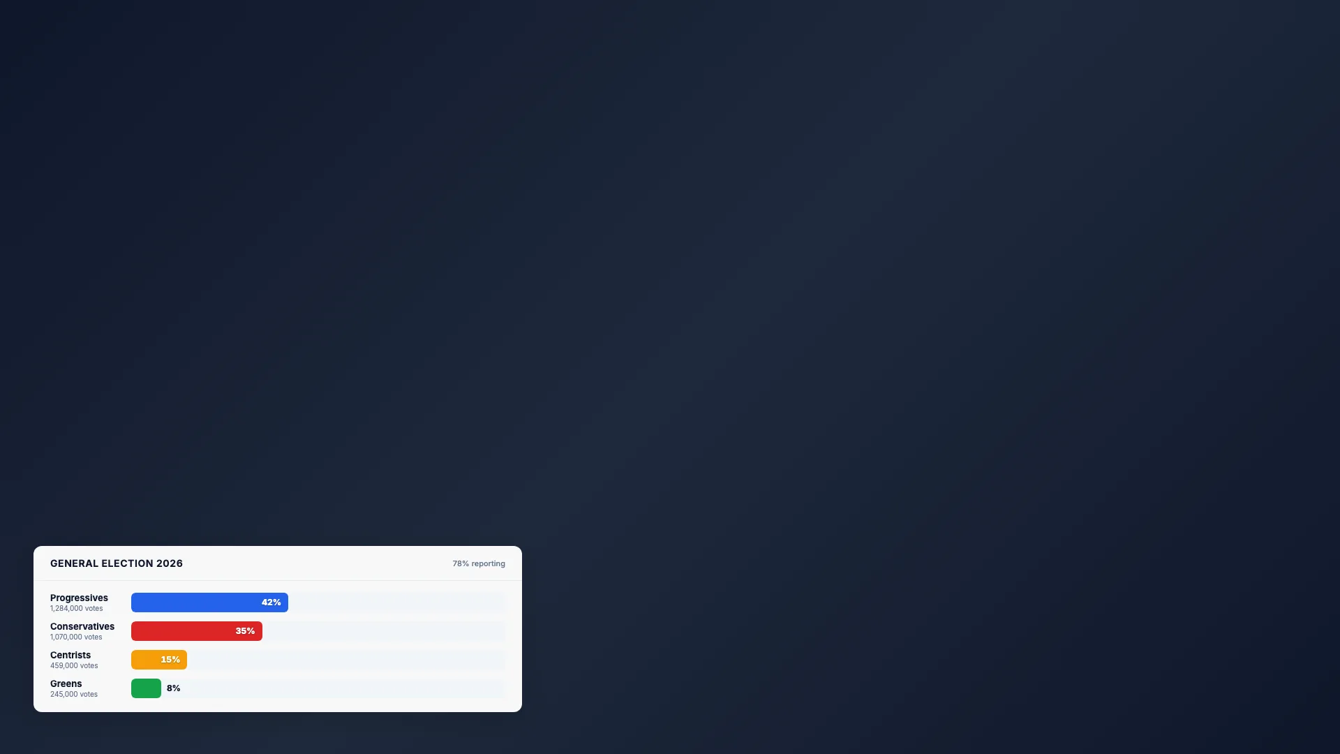
Election Bars
Animated percentage chart
Intermediate20 min
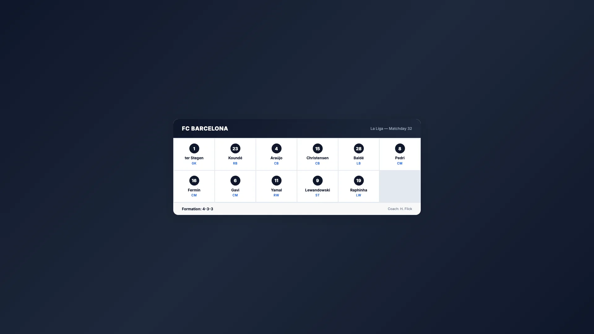
Sport Lineup
Team roster grid

Advanced25 min
Score Bug
Live match scoreboard
Intermediate15 min
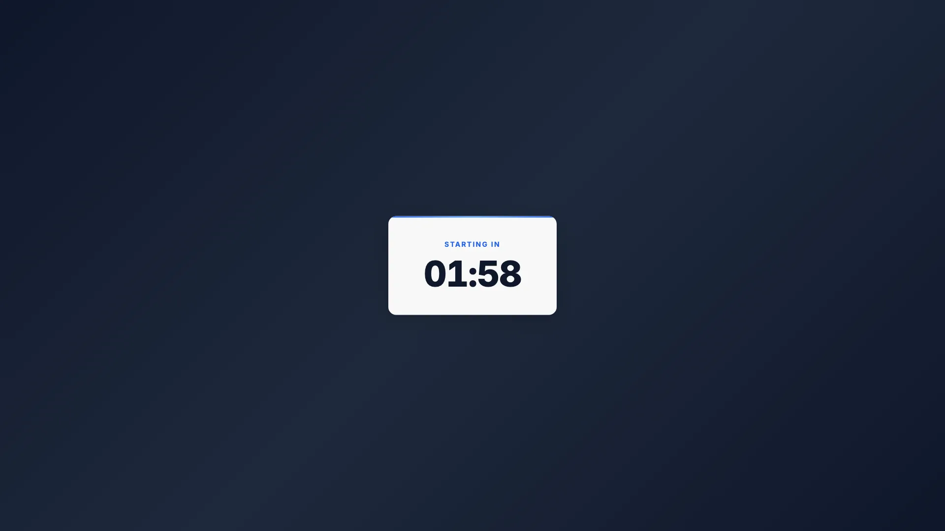
Countdown Timer
Self-ticking clock

Intermediate15 min
Breaking News
Full-screen urgent alert

Intermediate20 min
Weather Forecast
Conditions & 3-day outlook